5 Web Design Trends of 2018
Posted on March 19, 2018The web is constantly evolving and going through cycles of visual layout and design. Suffice it to say, we’ve come a LONG way since the early days of the internet. 2018 brings a fresh and interesting take on the way we interact with websites today. Here are just a few examples of web design trends that 2018 has to offer:
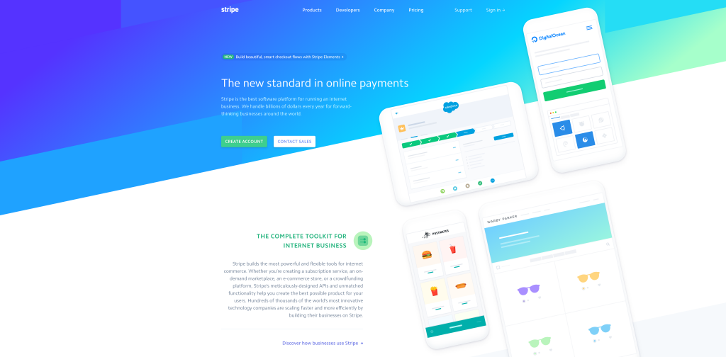
1. Slant Design
One of the latest “cool, hip” things to do is to integrate angled slants or backgrounds into a website’s design. When done correctly, this style can be a means of guiding user’s eyes throughout the content of the page or to give a more sharp, edgy feel to the design. Stripe’s latest design does a fairly good job at implementing this type of layout and even going so far as to slanting graphical elements on the page in concert with the background.
2. Large Header Imagery or Background Videos
Continuing the trend from recent years, large header graphics and imagery remain an important aspect of design in modern-day websites. Looping background videos also play a role in capturing the user’s attention and keeping them interested in what the website has to offer. After all, you want the first thing that visitors see when landing on your website to be the most attention-grabbing. Audi’s landing page for the new 2018 RS 5 Coupe does just that–It showcases their new car in motion so that potential buyers can get an idea of how the car looks on the road.

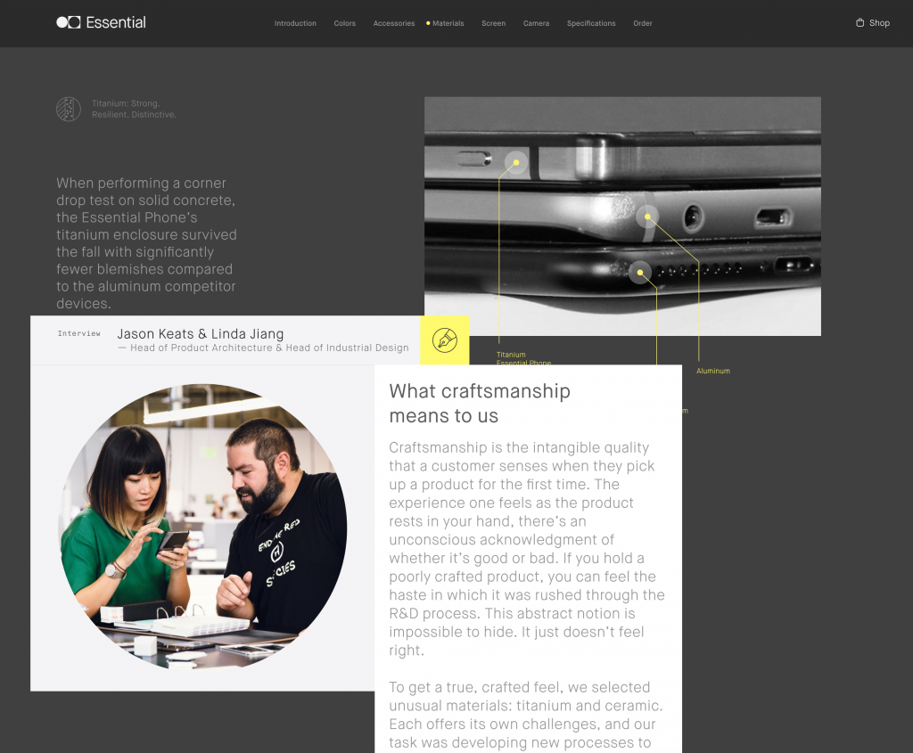
3. “Floating” UI Elements and Graphics
Another recent fad is to include user interface elements or objects that “float” on top of the page or give the appearance of depth to the website, as if the object is coming out of the screen towards you. This truly defines the meaning of “making it pop”… a phrase that most web designers despise. Product websites, such as Essential Phone, often implement this type of style to showcase certain features of the product. Notice as you scroll down their website, elements begin to overlap each other while large graphics of the product stand out from the rest of the content. When combined with scrolling parallax backgrounds, things really start to have a greater sense of depth. For a more fun and unconventional take on this, check out the Cheese Please app website.
4. Large, Bold Typography
These days, you can’t just throw some paragraphs up on a page and hope they stick. Typography design is a whole challenge on its own when it comes to the web. When done effectively, good typography can even substitute photos or other visual elements on the page. For instance, the VP Brands International site incorporates the use of large, heavy typography throughout the whole site, along with “knockout” typography combined with photos.

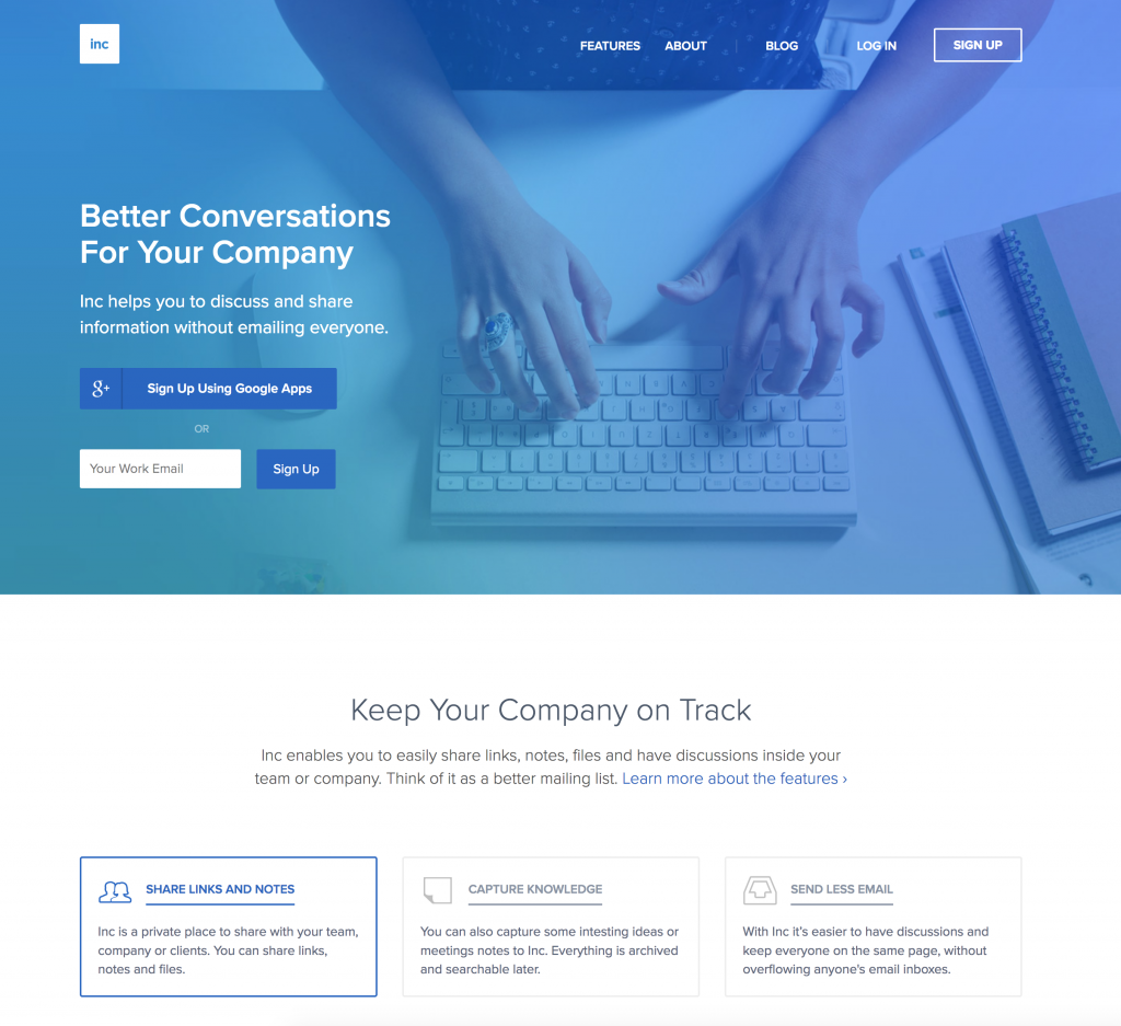
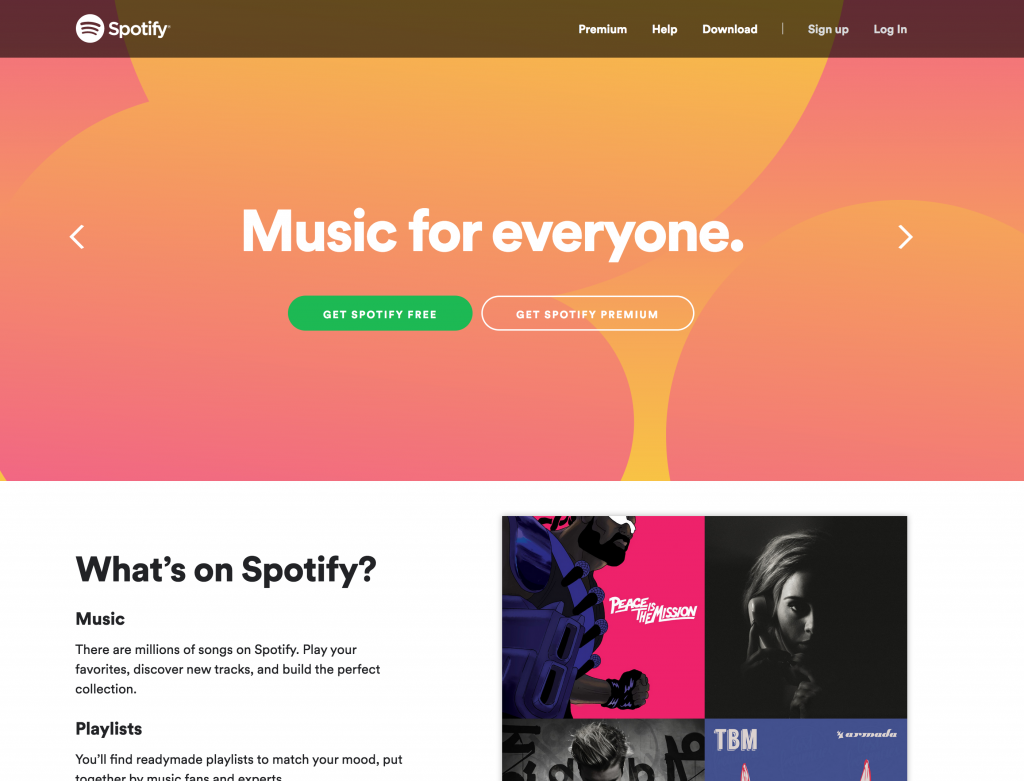
5. Colorful Gradient Backgrounds
Gradients are sort of a vicious cycle when it comes to the web. In the earlier days of the web, the cool thing to do was to create a gradient button or background in Photoshop to display on your site to give elements a bit of depth. Then, things started transitioning more towards flat design and material design, which was made popular by Google. These days, gradients are making a comeback ever since Apple included colorful gradient icons in their iOS7 update. Not to mention CSS support for gradients has also come a long way. Much like the Stripe example from earlier, designers and developers can get pretty crafty when it comes to implementing colorful gradients. Inc and Spotify are just a few examples of sites utilizing colorful gradient styles.